feedback

Emily Tobias

Hoefler & Frere-Jones rocks a Violet Color Scheme with the ads for their new Typeface, Forza

Friday, October 29, 2010

Again, I was going through magazines and I came across this ad for Forza, a new type family by Hoefler & Frere-Jones. Check out the really nice violet color scheme that they designed!

No Comments »

Wired & Violet

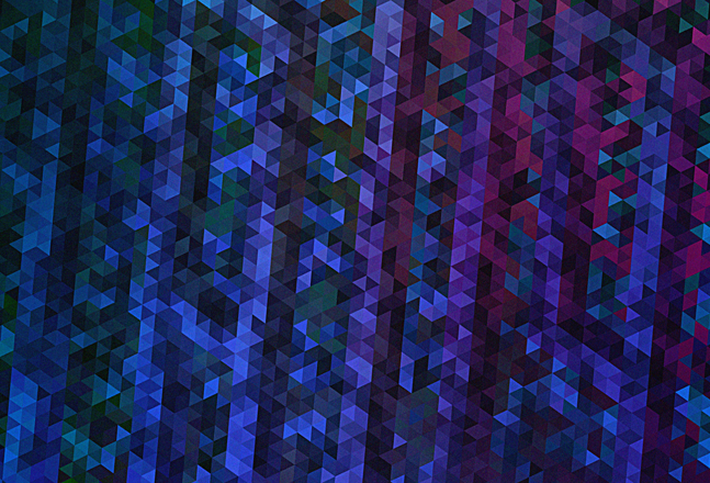
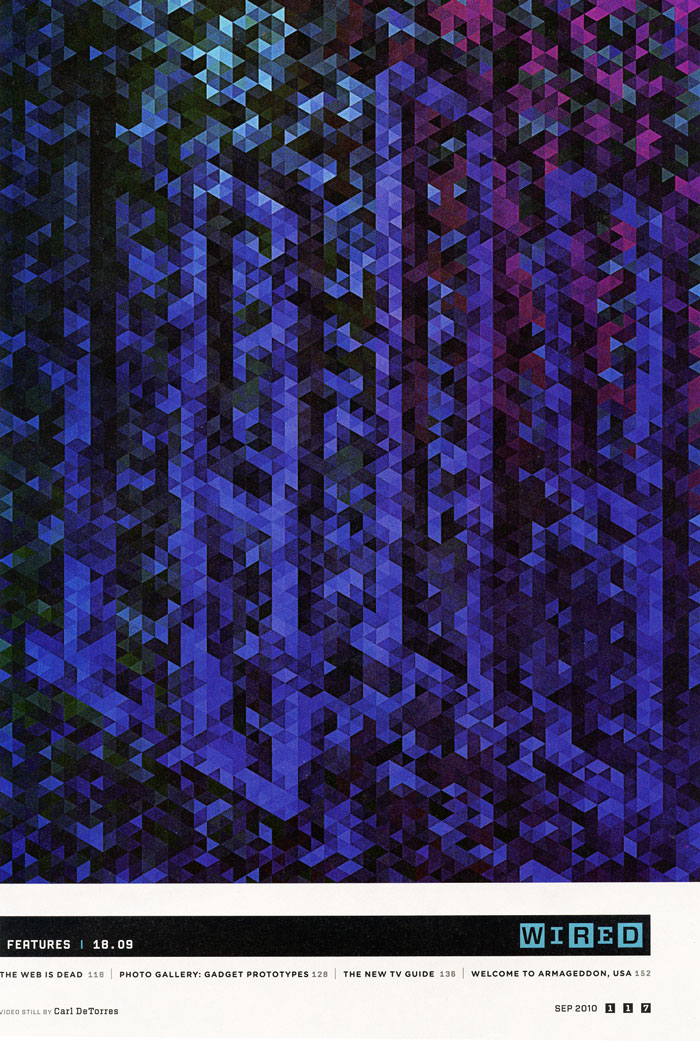
I am surprised that it has taken me so long to mention my all-time favorite magazine, but I was flipping through some of my Wired magazines yesterday and I noticed this page. I love how the designer created this pattern – using triangles, to produce such an eye-catching page! OK, so I was reading the fine print on the bottom of the page and it says that this design is a video still, even cooler! Plus, it is violet!

Here is a link to Carl DeTorres’ webpage showing the design both in print and ipad form.

No Comments »

The Jonathan Adler Store: a magical wonderland of color and design in the heart of super chic Soho (session 08)

Wednesday, October 27, 2010

I guess I am still getting used to being a real graphic designer because visiting the Jonathan Adler store for class is such a surreal idea that I am continuing to convince myself that we actually went here for a field trip! I can say for certain that a trip to Jonathan Adler would not be part of the curriculum had I decided to stay in Political Science! We met with Ben Brougham, who is one of Jonathan’s stylists, and he works on special projects as well. Aside from the fact that Ben had impeccable fashion and a glorious British accent, he has some real insight into the company and the genius of Jonathan Adler.

He began by explaining that Adler’s items can be separated into three categories:

1. Pop – referring to pop culture, the 1960s mod era, and the use of white and color.

2. Deluxe – luxurious items, old Hollywood Glam and such

3. Natural/Modern Rustic – natural wood tones and inspiration from (in my opinion the best furniture ever) mid-century modern design.

With these three categories Ben went on to emphasize that the overarching theme that Jonathan abides by is called “Happy Chic.” This idea is really hard to argue with… maybe it is because I am in the demographic that gets his tongue and cheek attitude, but it seems almost impossible not to laugh and smile when in the store. One of my favorite things that I noticed was an advertisement for jonathanadler.com painted on the wall inside the store that said: “your 24-hour pot dealer www.jonathanadler.com.” It was these little details that I noticed which made me smile and think “wow, what a great idea” at the same time.

(I found the above mentioned slogan on the website… here is a screen shot!)

For me, the only disappointing aspect of the store is that there was a complete absence of Violet, almost as if it had been excluded from the color party that is Adler. I could not think of a clever way to ask where my color (I feel almost defensive of Violet now!) was but I guess that means I will just have to keep returning to the store to seek it out… that should not be a problem!

One other note… if you only click once on jonathanadler.com, make sure you read his about page!

After reading his Bio (besides the fact that it is in list form which is fantastic) if you are not on the floor laughing, then there is something seriously wrong with you!

No Comments »

Thoughts on Pantone (session 07)

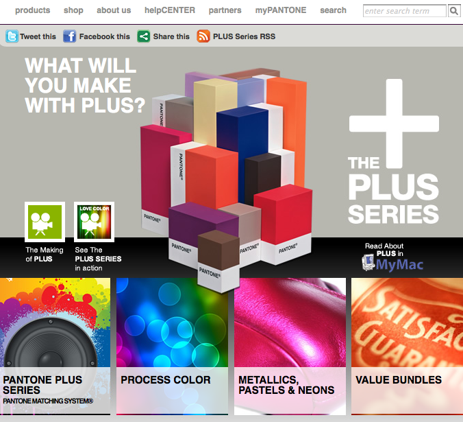
The other week our class was extremely fortunate to have Giovanni Marra, Director of Corporate Marketing for Pantone as a guest Lecturer. In the first part of the lecture, Mr. Marra took the time to explain the new Plus Series. The Plus Series is a new take on the Pantone Matching System in that the color books have been reorganized (with the designer in mind) so that they are organized by color. To me this is a huge leap forward and gives me even more incentive to invest in more Pantone Books. Additionally, he spoke about the history of the company and he showed one of the newest products in the Pantone line: The Capsure. Although I will not be purchasing one anytime soon (it is $649.00!) just knowing that this kind of technology exists is inspiring.

Another aspect of Mr. Marra’s lecture that I found to be particularly interesting was the portion involving color trending. As he was explaining the notion of color trending and forecasting I immediately had a daydream involving an elete group of Pantone color trenders meeting in some secret war-room deep underground, making decisions about which colors would matter 24 months in advance. OK, so there probably is no “secret Pantone war-room,” it is still fascinating when you think about the fact that very few people have a huge influence on the global climate regarding fashion, interior and graphic design.

The real “meat” of his lecture was a beautiful interactive presentation that showed how color communicates emotion and affects all around it. Just thinking about the lecture (combined with Michelle’s lectures on color) is helping me to really consider all of my color choices as a designer. Overall, I feel extremely lucky to have had the opportunity to get that close to the world that is Pantone!

No Comments »

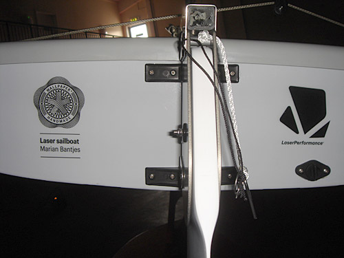
Marian Bantjes’ Laser Sailboat

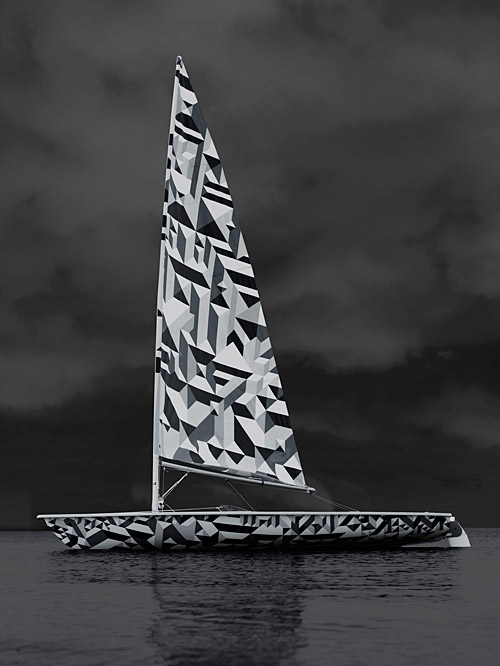
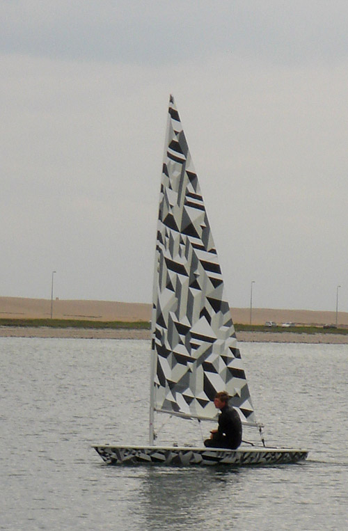
I have grown up sailing. In my family we never had a summer house, or belonged to a pool, but we do have a boat. Icefire is a 34-foot Tartan that I have spent countless weekend adventures on. When I saw that designer Marian Bantjes had teamed with Laser to design her own version of the classic sailboat, I had to post the photos.

Here is a link to the post about it on Banjtes’ website.

No Comments »

Search

Recent Posts

Categories

Archives